

The recent arrival of the 2022 LEGO City Space sets has left some people myself included, wondering if the spirit of Classic Space has returned, while others remained unsatisfied, stating reasons of not enough blue and grey, an absence of transparent yellow, or that the blue in the windscreens was just not dark enough. But what does Classic Space actually mean?
Virtually everyone will agree that the period began in 1978, with the release of the first LEGO Space sets to feature minifigures. But when does it end? And what is it that makes those sets ‘Classic Space?’
The Era of Classic Space is typically taken to refer to the space sets released with minifigures between 1978 and 1987. The minifigures had a simple smile, as well as the logo on their torsos – and nothing else. There were no visors on their helmets. Vehicles typically featured the ‘Space Logo’ BUT not always. Cabins were pretty optional and space ships were controlled, on the whole, using steering wheels.
Many would consider that the ‘Classic Space’ era ended with the arrival of the Futuron and Blacktron factions. Others would consider that all themes before 2000 (up to and including Insectoids and UFO) might be considered to be ‘Classic Space Themes.’ After this time, we would typically see two or more factions appear throughout a sub-theme.
Today, I would like to survey the Space Sets of the Classic era: 1978-1987, and look at how the theme evolved over time: new elements and use of colour; the subject matter, types of set and of course the minifigures themselves.
Come and join us as we embark on this Fantastic Voyage. Even if the new City Space Sets do not meet your idea of Classic Space, perhaps you can see that Classic Space Fans remain in the thoughts of The LEGO Group’s design team to this day, more than 40 years after the Alpha-1 Rocket Base made its debut.
Parts of this series are adapted and updated from a presentation I gave at BrickCon2021, with consideration of new sets, arriving in the 2022 range. But I digress.
In the Beginning
The arrival of LEGOLAND Space in 1978 (USA) or 1979 (Rest of the World) inspired a generation of kids to suspend belief and look to the skies. It was only a matter of time before ‘to swoosh’ became a recognised verb.
But the arrival of minifigures did not signal the first LEGO sets inspired by space exploration. The Apollo program ran from 1961 to 1972, with 6 crews landing on the moon during this time. and the very first LEGO set to feature a rocket was a blister pack produced by Samsonite in 1964:


Offering a selection of macaroni bricks, 1×2 bricks and slopes, this was a great example of approaching the potential of the LEGO system, even in the absence of the ‘ideal’ shaped elements.
In 1973, as the sun was setting on the Apollo Program, the first Rocket Base playset was released, with a rocket, brick-built gantry and multi-wheeled rover, the primary colours really popped
And then, in 1975, set 367 Space Module with Astronauts (565 Moon Landing in the US) gave us stylised brick-built Lunar Exploration Module, along with 3 astronauts – with their lineage coming from Homemaker figures – albeit with US flags printed on their chest and no gloves on their hands
A Brave New World
With the arrival of the minifigure in 1978, we gained three distinct play-themes arrive: Castle, Town and Space: Past, Present and Future. During 1978, LEGO Space sets were limited to the United States, with release upon the rest of the World occurring in April 1979. The preamble for LEGOLAND Space in the UK catalogue that year read: “You can build your own planet with the new baseplates. And with the Space Ships. Rockets and Radar Vehicles, you can go exploring far, far out in space.”
The Space sets featured astronauts in red and white, with matching helmet and air tanks. They were all smiling, and on their chests they had a large golden planetoid, being circled by a shuttle like space craft. For many of us, these sets arrived at just the right time. Star Wars was still screening in the cinemas (after 2 whole years); Battlestar Galactica had arrived in 1978 and in 1979, Buck Rogers in the 25th century was on prime time television. On the other side of the pond, and the other extreme of televisual budgets, Tom Baker was well into his tenure as Doctor Who, and another BBC Series, Blakes 7, was getting us used to the idea of space ships made out of egg cartons, detergent bottles and sticky-backed plastic.

Couple the pop culture millieu at the time with concurrent testing of the Space Shuttle Enterprise, being launched from the back of a 747 over California, and the imaginations of a generation were primed to imagine the possibilities of exploring the universe, and despite the ostensibly exploratory nature of the toys, it was almost impossible to wave one around in the air without making ” Pew Pew” noises.
But what gave that first wave of sets the timeless appeal that it has? Was it the distinctive blue/grey/transparent colour scheme? Was it the mixture of flyers, bases and rovers in a variety of sizes? Was it the collection of astronauts working together for a common goal. We may not have known what that goal was yet, but they were all heading there together. This gave us the chance for extremely open-ended storytelling in our play.

Certainly, the colour scheme was extremely distinctive: In that first wave, grey was the dominant colour, especially for the smaller sets, while larger vehicles and the bases featured blue and transparent yellow. There were other colours in the palette: transparent green, red and blue; black and white; but these were used sparingly.
At this time, grey elements were virtually reserved for use in LEGO Space Sets. LEGO Town was decked out in predominantly primary colours, as well as black and white. Grey was restricted to helicopter blades, roads, loudspeaker assemblies and exhausts on heavy equipment. Essentially roads, and elements that might be considered silver/chromed in real life. In the first castle sets, grey was reserved for Helmets, shields and swords. Eventually, they extended to include Stone and brick walls.
In Space, every small vehicle was predominantly grey. The blue and yellow were reserved for the larger models. There were also some elements that characterised Classic Space – many were restricted to Space initially, perhaps moving into other themes after many years.


Some of these elements were unique, some were merely unique to Space as grey. But at the time, space was defined by the cones, the wedge plates and radar dishes. The 2×2 ‘supports’ and air tanks, as well as the 2×2/2×2 bracket elements were all limited to space. The 2×3 and 3×6 slopes with the space logo and the 2×2 slopes/inverted slopes decorated with a computer screen were a core characteristic of space sets at this time. And of course, there were the base-plates: the distinctive grey craters or the landing pad, inviting modification with your own LEDs if you had the parts, a soldering iron and a good steady hand. This collection of elements was expanded with time.
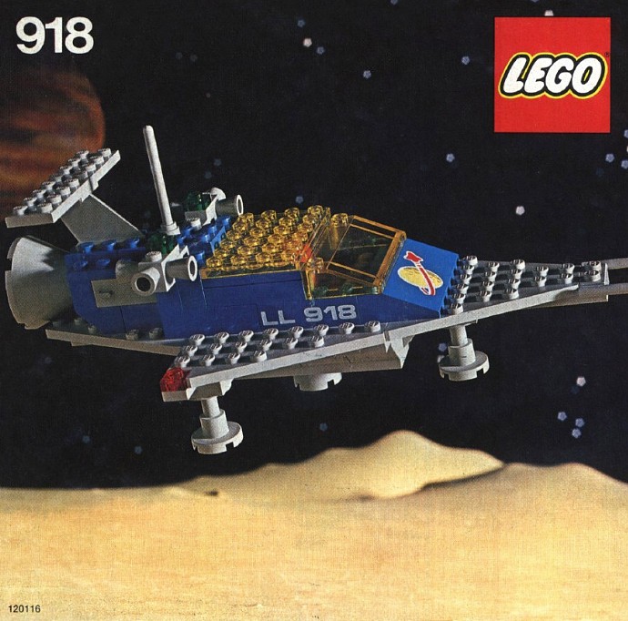
At this time, enclosed spacecraft such as 918,924 and 928 had a fixed windscreen, and access to the cabin came through the roof, using a transparent plate attached to a pair of hinges. In years to come, the entire cockpit window would be hinged.
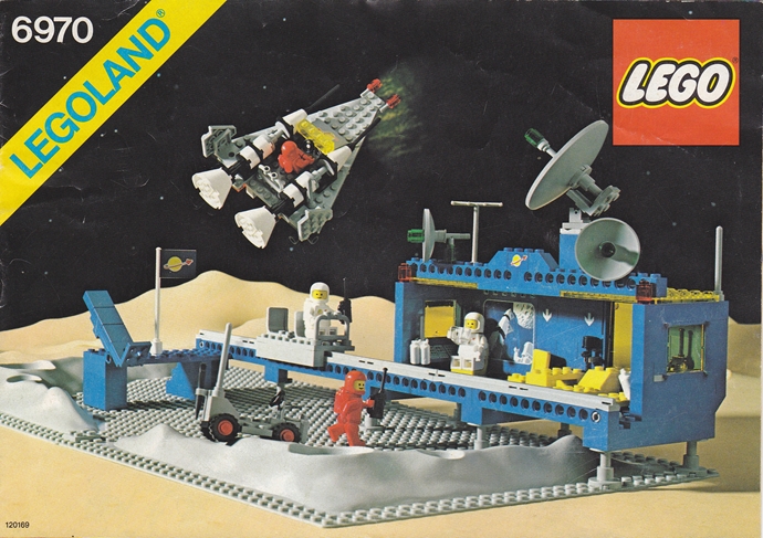
In 1980, we were introduced to the Beta-1 command centre – a new base with a ramp to launch a spacecraft, a buggy and monorail running between the launch pad and the command centre itself. The idea of including bedroom/ rec hall was pretty revolutionary at the time. Some of the smaller sets in this wave helped us to understand what minifigs were doing out in space: searching for minierals and digging them up!


1981: The Winds of Change
The following year, we saw some significant changes across the entire range of new releases.
The smallest sets were no longer exclusively grey, with the occasional transparent elements: we saw greater use of black and white, in conjunction with grey wings. Black thrusters, antennae and ladder elements are introduced. We also start to see the birth of greebling, adding extra details to the craft, particularly with the introduction of ‘jet engines with grooves’ and ‘white bricks with vertical black lines printed on the side.’
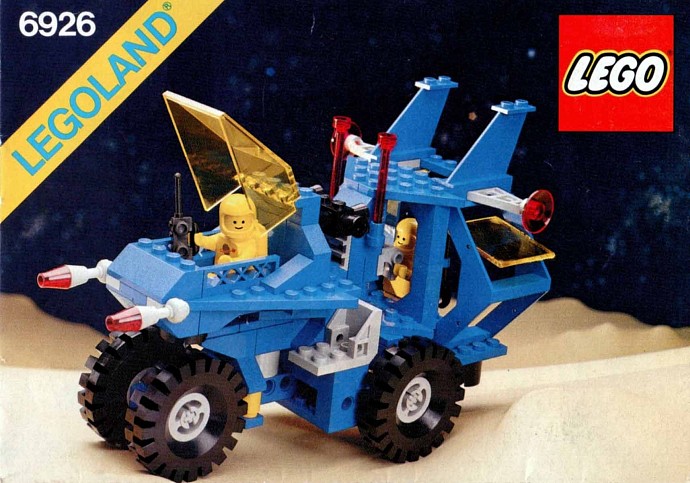
A new spaceship is introduced: 6929 Starfleet Voyager, with a predominantly white and grey colour scheme, and a transparent blue cabin. The 6927 All Terrain Transport is also released, bringing us a rover in the new colour scheme, transporting a small lab or outpost in the traditional blue and transparent yellow livery. This set was also one of the first times that a headlamp/washing machine/Erling brick was used in a Space set, while the Star Fleet voyager featured a ‘droop-snoot’ nose cone, similar to Concorde.


1982: Are You Turning yellow?
The 1982 wave of Space set was relatively limited: just 3 sets, along with a minifigure pack. We saw 2 new rovers, and a set with two smaller spacecraft. One of these rovers, 6950 Mobile Rocket Launcher kept the original colour scheme intact.
There were three significant introductions – the yellow spacemen, allowing the creation of naked minifigures for a generation, new solid black wheels (6880), and the spoked radar dish. While radar dishes had always been an integral part of space sets, there was something much more spacey about these ones. I was delighted to find one of these on the new Moonbase set. The 6950 Mobile rocket Launcher gave us flashbacks to the 897 Mobile Rocket Launcher, but with additional degrees of bulk, greebling and attitude, while the 6890 Cosmic Cruisers hinted at where the colour scheme was heading in years to come.


1983: What’s Holding You Up?

We saw a new command base introduced in 1983. This brought with it a new strut/support element, felt to be sufficiently important that it was highlighted in the print catalogue at the time. Just as iconic, we also saw the introduction of both the ‘Metal Detector’ and ‘Camera with side sight’ elements that year. Just what you need to detect minerals and to record your adventures (or shot at things) respectively.
We start to see blue increasing in prominence as part of the colour scheme this year.


I really appreciate the way that the Command Centre sets virtually always came with one or two rovers, as well as a small flyer or two. But there was one more set introduced that year: the 6980 Galaxy Commander.


This ship is interesting from a historical perspective as it is the first ship with an enclosed cabin to feature a click-hinge enclosed cabin, rather than a fixed windscreen with a lifting roof. This is also the first ‘capital ship’ to be released since the Galaxy Explorer debuted in 1979. This was the last year that any sets from the original drop would appear in the catalogue: the iconic moon buggy and mobile rocket launcher were also around at this time. All were gone the following year.
1984: The Blue Period
In 1984, we returned to the Blue/transparent yellow/ grey colour scheme – The grey elements were less prominent in these sets, but key in giving these sets their unique forms. There were a few more changes that helped to define this year’s releases: black and blue spaceman minifigures, completing the original 1970s colour lineup or Primary colours as well as black and white; We see new transparent elements – including a transparent yellow cabin, transparent red antennas and scanning disks. There was one more elements that really defined the look of space sets from this era: the frame space wing. Acting as a ladder, nose-cone, walls and wings, this element enhanced the futuristic look of the theme. It has recently reappeared after a prolonged absence, and finding it included in 60350 Lunar Research Base truly gave me joy!
While the colours might have been a little unclear to those of us playing with the sets at the time, Jens Nygaard Knutsen, in an interview with current designer Mark Stafford, said:
“The original two colors (red and white) were explorers, yellow were scientists, blues were
Jens Nygaard Knutsen “The Truth about LEGO SPACE” Brickjournal #6 Volume 2 Summer 2009: 38-43.
technicians or mechanics and I guess the black were warriors, but we were not allowed to make a big deal out of this. We were not allowed to make war.”
Interestingly, in the 6951, 6971 and6981, we see minifigures carrying handheld scanners and a ‘video camera’ which certainly looks like it might have a good end, and a bad end to be standing at…


The 6951 Robot Command Centre/Cybernaut was a radical new design, bringing a ‘giant robot’ look to LEGO sets for the first, but by no means the last, time. New window frames at 45º to the vertical helped contribute to the look of this set, along with the 6971 Base. Just why these windows were able to open remains a mystery to me. However, this is where we start to see the bases become more angular, rather than boxlike – perhaps representing an inflated dome, or perhaps just trying to look cooler than those which came before it. I suspect that this set inspired, in part, the look of the 60349 Lunar Space Station. The use of inverse slopes, 1x4x3 in that set felt like a more complete version of the sloped windows in 6971, with less of the base open to the outside atmosphere(or lack thereof).

1985-1987: Things Go Greebly, And Start To Get a Bit Confused.
From 1985 to 1987, we saw a number of new elements rolled out, which served to raise the greeble game to a new level, giving these previously simple toys new levels of surface detail, and avoiding the risks of a great big slab or blue or grey. We also see several different colour schemes roll out in parallel. Let us look at the new elements, and the way they influenced the overall look, and then consider the different colour schemes in use.
Great Greebles
In 1985, we saw a peculiar collection of elements introduced: While steering wheels have worked for every buggy and spacecraft to date, control levers/antennas are introduced and will become the dominant control mechanism in coming years. Small (2×2) radar dishes as we know them today are introduced, a new movie camera, doubling as a SNOT brick, and new printed 1×2 tiles, with a computer screen/control and an arrow. A mysterious corner panel is also added, along with flexible hoses in translucent yellow and black. All of these elements go towards giving new forms to craft released at this time, forms more detailed than those that came before.

You can see these elements enhance the appearance of a number of sets from this time:


We start to see some of those things we had always taken for granted begin to change. Until now, all spaceships were controlled with a simple steering wheel. Control sticks, an alternative use for the new antenna element, appeared in 1985 and the following year, a new control console is released, in conjunction with a new cockpit brick: a SNOT Element with a tapered slope on top. Initially, the element appeared with a ‘v’ print but appeared subsequently with the Classic Space logo printed on it.


.
We also saw a few new decorative tiles, including a tapering wedge with the Classic Space logo print.
While these new elements allowed us to increase the level of detail we could incorporate into our models, there was something afoot with the design language and cues being used in the space sets.
During this time, we also see the introduction of small brickbuilt service droids accompanying our astronauts


New Colour Schemes
As we move forward during these final years of LEGO Classic Space, we find that our primary models also take a departure from previous design cues. Having seen a wave that was almost exclusively blue in 1984, we now see three distinct clusters of sets released between 1985 and 1987.

- Grey – with transparent Green, as well as some black trim
- Blue – with occasional bits of grey, moving over to white trim.
- White – Beginning in 1986, this felt like an inverse of the blue theme – mainly white, with transparent blue elements, this is perhaps closest to what we have seen in the current City Space ‘Artemis’ sets, although the current ‘blue’ is transparent light blue, compared to the transparent dark blue seen previously.
These colour schemes did not seem to follow any particular pattern: not to the type of craft or the colour of the pilot. It almost looks as if the designers were forming factions, fighting for the dominant colour scheme. Perhaps it was a deliberate plan – slightly different coloured craft could be working together or against each other – forming logical teams, should kids want to do things this way. Or was it just completely random?
Keeping Grey


As well as the smaller craft above, 1985 saw these three sets arrive: essentially grey vehicles with some black structural elements, but introducing transparent green cockpit covers, in a radical departure from anything that had come before. With a significantly sized one-man spaceship, and a large rover, there were some exciting new shapes apparent. The 6952 Solar Power Transporter is a particularly interesting design – bringing us a larger land vehicle, rivalled for part count only be the largest spaceships, and a couple of the bases.


The final wave of the Grey/Trans-green stream came in 1986, bringing another robot style base, as well as some smaller sets. Overall, this colour scheme is precogniscient of Space Police 2, not due for another five or six years.


Feeling a little Blue?
We have a few sets that are predominantly blue, with brightly coloured transparent elements highlighting the models, almost making them appear like misshapen Christmas Trees. The 6931 FX Star Patroller is a different story – bringing us a combination of trans blue, bright blue and light gray (along with some brightly coloured trim.) This blue cabin did not persist going forward.


In 1986, we saw the final ‘blue’ wave. while previously, vehicles had been blue with grey elements, in this wave, was blue with white trim used together in a mixture of small flyers and rovers, as well as the 6985 Cosmic Fleet Voyager.


Turning Pale in the Twilight of Classic Space
In 1986, we saw the release of one further colour scheme – one which has moved forward, to be recalled the most in today’s LEGO City Space sets. Predominantly white, these craft have transparent blue windows and black trim, along with a new 9V sound and light module, bringing sounds to our craft and robots, as well as coloured lighting.


In 1987, we saw the last of the sets that might be considered part of the original run of Classic Space. And things are starting to look really different: white is now the dominant colour featured across the theme. While we continue the colours of the Light and Sound models, the shapes change radically: octagonal cabins, reversed wings, finger hinges holding control levers all change the feeling in this final wave. The 6972 Polaris I Space Lab is the first space base to feature only one colour of minifigure (all blue).


Reflections on the Final Years of Classic Space
With these inconsistent colour schemes, we also start to see inconsistencies in the control interfaces: some use the new control panel element, some use antenna levers and some are still using steering wheels. The Traditional Space Logo – the planetoid being orbited by the shuttle – no longer has the prominence that it once had, only being truly obvious on the torsos of the astronauts.
The larger ships that we see this year: 6985 Cosmic Fleet Voyager and 6783 Sonar Transmitting Cruiser are the first of the ‘Mother ships’ to depart from the traditional ‘shuttle with wings’ design, adopting a more ‘container ship’ type of appearance. Indeed, wings become less necessary for use in the context of interstellar flight. By the time these sets were released, the real world Shuttle program was put on hold for a period of time, following the Space Shuttle Challenger disaster in January 1986. I do not know if this event was behind the change in design, or if the designers were feeling that LEGO Space was now mature enough to go in its own direction, rather than specifically seeking inspiration in the real world or direct predecessors


So… What Made the Classic Space Era?
Over the 9 years we were seeing new Classic Space sets released, the theme underwent many changes – colours, shapes, and designs.
We saw a collection of elements whose role were definitely ‘Space sets’: Truncated cones, sharply angled windows, sloped bricks printed with computers; strut units, thrusters, ray guns and metal detectors, and even the angled wedge plates serving as wings were restricted to space sets for many years.
Some colours at this time were also restricted to space: for larger elements: Transparent yellow and blue windscreens and windows (especially with blue frames); grey bricks and wedge plates; later on, even blue and white plates.
The overall colour themes of sets in this era morphed from the Iconic Blue/Grey/transparent yellow to White/Grey/ Transparent blue to White and blue with black trim (and indeed blue with white trim) through to the grey and transparent green, hinting at what might be to come in the future.
Some sets were relatively plain, while others were more extensively greebled.
Spacecraft changed from shuttles to narrower craft; larger ships became more ‘bus-like’ rather than jet shaped.

Rovers ranged from small to large; with and without cabins; exploring or mining.


Bases were initially simple box shapes, and moved to outwardly have an expanding equator. The final Polaris base was built like a four-sided pyramid. Plainly, all shapes can be used.


There were some things that could be considered to be pretty consistent during this era: Spacemen during this era were pretty consistent: primary colours as well as black and white, along with no visors on their helmets, while sets followed the themes of scientific exploration and research, be they bases, rovers or flyers of any description.
The elements: thrusters, A-frame wings, wedge plates before planes became mainstream, antennas, radar dishes, various greebles and printed slopes with computer screens were all integral to the theme.
The ‘makeup’ of the theme at any time: small rovers for transport, research and rocket launching, small shuttle craft; larger craft, with cargo bays containing buggies or laboratories; bases full of play features and minifigures- has served as a template for most play themes that followed- be they science fiction, castle or town.
For me, this is what embodies the spirit of Classic Space.
In the second half of 1987, it all began to change:
Entering the Age of Factions


In the second half of 1987, we saw new sets, with new designs, and new colours. One appeared to be derived from the white /trans blue space sets – this was Futuron. However, the figures had undergone some significant changes: A fashionable zip across the front of their torsos, and the addition of a light transparent blue visor to their helmets, which were now a slightly different shape.
But someone else arrived around the same time: Blacktron was a stark departure from the colour schemes we had seen before. As close to the negative colour scheme of Futuron as the current colour palette would allow, Blacktron had hidden their faces behind opaque black visors, while details on their spacesuits showedthat meant business and they featured the triforce emblem on their spacecraft. Were they the opposite of Futuron? See what happens when I convert the image to a photographic negative…


But more of that next time, when we shall consider the age of factions, from 1987-1999 .
Trying to define Classic Space remains a very personal decision. Is it a minifigure torso? It is a colour aesthetic? Is it a specific collection of elements? Or is it an attitude?
What is it that makes Classic Space for you? Leave your comments below, and follow the Rambling brick as we continue to Explore Classic Themes in this 90th Anniversary Year for the LEGO Group.
Sign up for our mailing list, follow @ramblingbrick and be sure to catch up with our podcast in conjunction with Jay from JaysBrickBlog.com, Extra Pieces. And until next time,
Play Well!

As always, I owe a great debt to Brickset.com, for images of Space sets from their database.
Interested in reading more?
I came across these articles while finishing this post: they talk more of the design process across the range, rather than the evolution of the theme per se.
Speculative Identities particularly looks at the design cues used within classic Space, including the ‘Space Logo, comparing it with that of NASA. The site in general looks at the design applied to science fiction in the popular culture.
This site has also reprinted with Jens Nygaard Knutsen from Brickjournal #6 volume 2. I would however recommend you consider purchasing the digital issue of the journal, if you find it useful.
Imagining the Future in Bricks: The Designs of Lego Space (Part 1 – 70s and 80s) from the Ancient Worlds blog discussed some of the real world design cues used throughout LEGO Space sets.
David Alexander Smith’s interview with Bjarne Tveskov, who joined the Space design team the mid 1980s for Bricks Culture Magazine (now, unfortunately out of publication) is duplicated on his personal blog ‘Building Debates’
Well written and informative. I love the classic space models, I never liked most of the white and mostly blue d
Sets after 1983. So glad there are new Yellow translucent windshields.
David at davidslegoroom.blogspot.com
Great detailed Article Richard, you’ve refreshed some memories for me! 1982’s 6880 was the last set that was bought for me (or I bought I can’t remember which) which would have also been the end of my collecting at that time. I had nothing past this until recently when I started collecting again as an adult. I personally thought my collecting had been over more years as a child but looks like it was a brief 79/82 with perhaps some Town sets after this point. This places most of my fond space memories from between 5 and 8 years old, but some of the best years as a child. So glad I have come back to Classic Space as an AFOL!
Awesome article. Brought back so many memories.
I consider Classic Space, as defined here, as Futuron I, even though that no one has ever defined it as such. I also consider the newer pink, green, brown, purple, and orange Classic Space/Futuron I inspired LEGO Minifigures as part of the theme outright. I am also convinced that the black Classic Space/Futuron I LEGO Minifigures as the prototypes of the Space Police theme, or as the security forces that eventually became Space Police I.
I also consider this to be the timeline of how the different factions of Space.
Ninja
The Early Astronauts/LEGO Town Space Sets
The Later Astronauts/LEGO City Sets
Alpha Team
Agents
Ninjago
Monkie Kid
Exo-Force
Alien Conquest
Life on Mars
Mars Mission
Classic Space/Futuron I
Futuron/Futuron II
Space Police I
Exploriens
Galaxy Squad
Star Sheriffs
Space Skulls
Blacktron I
M-Tron
Blacktron II
Ice Planet 2002/Ice Galaxy 2002
Space Police II
Spyrius
Unitron
Roboforce
U.F.O.
Insectoids
Hydronauts
Aquanauts
Stingrays
Aquaraiders
Rock Raiders
Power Miners
[…] the previous article in this series, we looked at Classic Space – and what might define the theme: More than the colours, the sets of this era were united in […]
[…] I have continued to explore the worlds of LEGO Classic Space and beyond, I have seen it through old catalogue scans, battered box photos and crumpled, stained […]